
If the cart is where shoppers say “I want this,” the checkout is where they prove it.
But even after all the effort of getting them there, SEO, ads, email, UX, you’d be shocked how many brands lose the sale in the final step.
Why?
Because the checkout process creates micro-barriers that interrupt the flow.
Not big enough to crash the page.
But just annoying, confusing, or untrustworthy enough to make customers quit. And unlike other leaks, this one stings more because you were so close.
This chapter is about diagnosing and eliminating those micro-frictions so more people finish what they started.
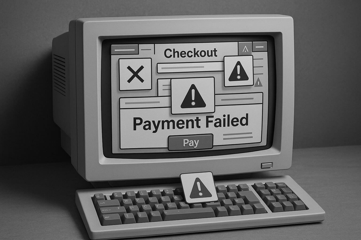
Why Checkout Abandonment Happens
Most default WooCommerce checkout pages aren’t optimized for modern buying behavior. They assume every customer is willing to fill out a dozen fields, guess where to click next, and pull out a credit card without hesitation.
But that’s not how consumers shop anymore.
Mobile-first buyers want clarity, speed, and control. If they encounter a long or clunky form, unclear steps, or can’t find their preferred payment method — they don’t troubleshoot, they leave.
Remember: this is the last thing standing between you and the sale.
Even small issues here have a disproportionate impact on revenue.
🧠 The Psychology of the Final Step
At checkout, the buyer is at their highest level of intent but also their highest level of sensitivity.
They’re about to spend real money. They’re handing over personal data. In the back of their mind, doubts start to creep in: “Will this work? Can I trust this? Am I going to regret this?”
Your checkout’s job is simple:
- Eliminate every shred of doubt
- Reinforce trust, ease, and security
- Make completing the purchase feel effortless
Every unnecessary field, extra scroll, hesitation point, or inconsistency stacks friction and increases the odds they’ll bail before clicking “Pay.”
Checkout Friction Signals to Watch
| Signal | Root Cause |
|---|---|
| Form abandonment | Too many fields, confusing inputs |
| Long pause on shipping step | No delivery ETA or unclear cost |
| Multiple attempts at payment | Failed card, unsupported method |
| Bounce after coupon entry | Code failed or no feedback |
| High mobile checkout exits | Layout issues, tiny buttons, keyboard overlap |
You can catch most of these via:
- Session replays of checkout drop-offs
- Funnel step analysis in GA4
- High cart-to-initiate checkout, low purchase rate
- Click tracking on form fields and payment retries
Checkout Friction Audit Checklist
Instead of guessing where customers might be dropping off, use this simple audit process to help you catch layout issues, missing trust elements, speed problems, and usability blockers before they cost you sales. Audit regularly across devices and traffic sources to keep your checkout experience clean, fast, and conversion-focused.
Only ask for what’s truly necessary to complete the purchase. Optional fields like “Company Name” or “Order Notes” should not block or distract from checkout flow.
Use real devices, not just emulators, to catch spacing issues, button overlaps, or input glitches.
Customers should immediately know they can pay easily and securely without digging around.
Use geolocation to pre-fill country and estimate shipping dynamically so buyers don’t have to guess.
Sticky buttons on mobile are critical — don’t make users scroll endlessly to finish their checkout.
Show an immediate success message if the code works, and if not, offer a helpful alternative (“Try one of these deals”) instead of a cold error.
Make it easy for returning users or browser-saved profiles to complete checkout with minimal typing.
Reinforce security at the exact moment customers are entering sensitive details (e.g., “Secure SSL Checkout,” “Your information is protected”).
Slow loading during checkout creates immediate anxiety and bounce risk. Test with throttled network speeds to simulate real conditions.
If users make a mistake, show them instantly and explain what to fix — without forcing them to hunt around.
Limit distractions, minimize visual noise, and structure fields logically (e.g., name → address → shipping → payment).
Never block progress with popups or force users to reject offers just to complete their purchase.
Heavy scripts like Klarna, Afterpay, or PayPal SDKs shouldn’t block the first meaningful interaction on mobile.
Monitoring Payment Failures
Even with a perfect checkout design, some buyers will still fail to complete payment and if you’re not tracking why, you’re flying blind.
Monitor payment failure rates directly inside your payment processor (Stripe, PayPal, etc.) and your ecommerce platform. Look for patterns: card declines, fraud triggers, unsupported payment methods, or gateway errors.
High payment failure rates often point to hidden checkout bugs, missing payment options, or configuration issues. Fixing these can recover revenue you didn’t even realize you were losing.
Tip: Set up automated alerts or dashboards to catch spikes in payment failures in real time. A sudden jump usually signals something critical broke.
Eliminating checkout Friction
1. Remove unnecessary fields
Cut the clutter. Only ask for what’s truly essential: name, email, shipping address, and payment info. Every extra field adds friction — especially on mobile.
2. Prevent unnecessary scripts and plugins from loading on checkout
Your checkout page should be a clean, focused experience, not a loading ground for marketing tools. Disable chat widgets, A/B test scripts, popups, heatmaps, and anything that doesn’t directly support the sale.
Tools: Perfmatters, Asset CleanUp
3. Enable express pay options
Offer one-tap checkout methods like Apple Pay, Google Pay, Shop Pay, PayPal, or Venmo. These build trust, save time, and dramatically improve mobile conversions.
4. Show trust signals
Shoppers need confidence to enter payment info. Add visual trust cues like SSL badges, payment icons, customer service links, and money-back guarantees near the final CTA.
5. Auto-detect and validate addresses using APIs
Use Google’s address autocomplete to reduce typos and form fatigue. Auto-validation minimizes failed shipments and reduces customer frustration.
6. Use inline validation for form fields
Tell users in real time if a field is invalid or missing — don’t wait until they hit “Submit.” Highlight problems clearly and guide them to fix errors without frustration.
7. Provide real-time support inside checkout
If something goes wrong, users should know help is one click away. A discreet chat bubble, help icon, or FAQ dropdown can keep a potential buyer from bouncing.
Tip: Time the widget to appear after interaction, not immediately, to avoid distraction.
8. Localize payment gateways for international buyers
Not all countries use Visa or Mastercard. Offer localized payment options through Stripe, Mollie, Adyen, or region-specific processors like iDEAL, Klarna, or SEPA.
Also localize language, currency, and tax handling where possible — especially if you’re running international ads.
9. Optimize for Mobile First
Mobile shoppers should never have to fight your checkout. Use the numeric keyboard for fields like zip code and phone number to speed up input. Design buttons with a minimum height of 44 pixels to make them easy to tap without frustration. Avoid layout shifts caused by toggles, accordions, or expanding fields that can throw off the user’s flow mid-checkout.
Upgrade your checkout with these plugins
The following plugins provide many of the outlined optimizations in this chapter, right out of the box:
- FunnelKit – FunnelKit turns your WooCommerce checkout into a true sales funnel. It lets you create optimized multi-step checkouts, one-click upsells, order bumps, and even full sales funnels — all designed to increase your average order value and improve completion rates without custom coding.
- CheckoutWC – CheckoutWC replaces the default WooCommerce checkout with a high-converting, Shopify-style experience. It’s built to eliminate friction, simplify the buying process, and help your store look and feel instantly more professional, especially on mobile.
- CartFlows – CartFlows focuses on turning your checkout into a complete conversion machine. Beyond optimizing the checkout page itself, it lets you build full pre-purchase and post-purchase funnels with upsells, downsells, and thank you page offers — helping you maximize revenue from every transaction.
Final Thought
Your checkout is not just a transaction form.
It’s your last chance to reinforce ease, trust, and momentum.
When it’s fast, clear, and intuitive—people buy.
When it’s clunky, bloated, or breaks expectation, they vanish.
Fix this step, and you don’t just recover lost revenue, you make every single acquisition dollar more profitable.